
work
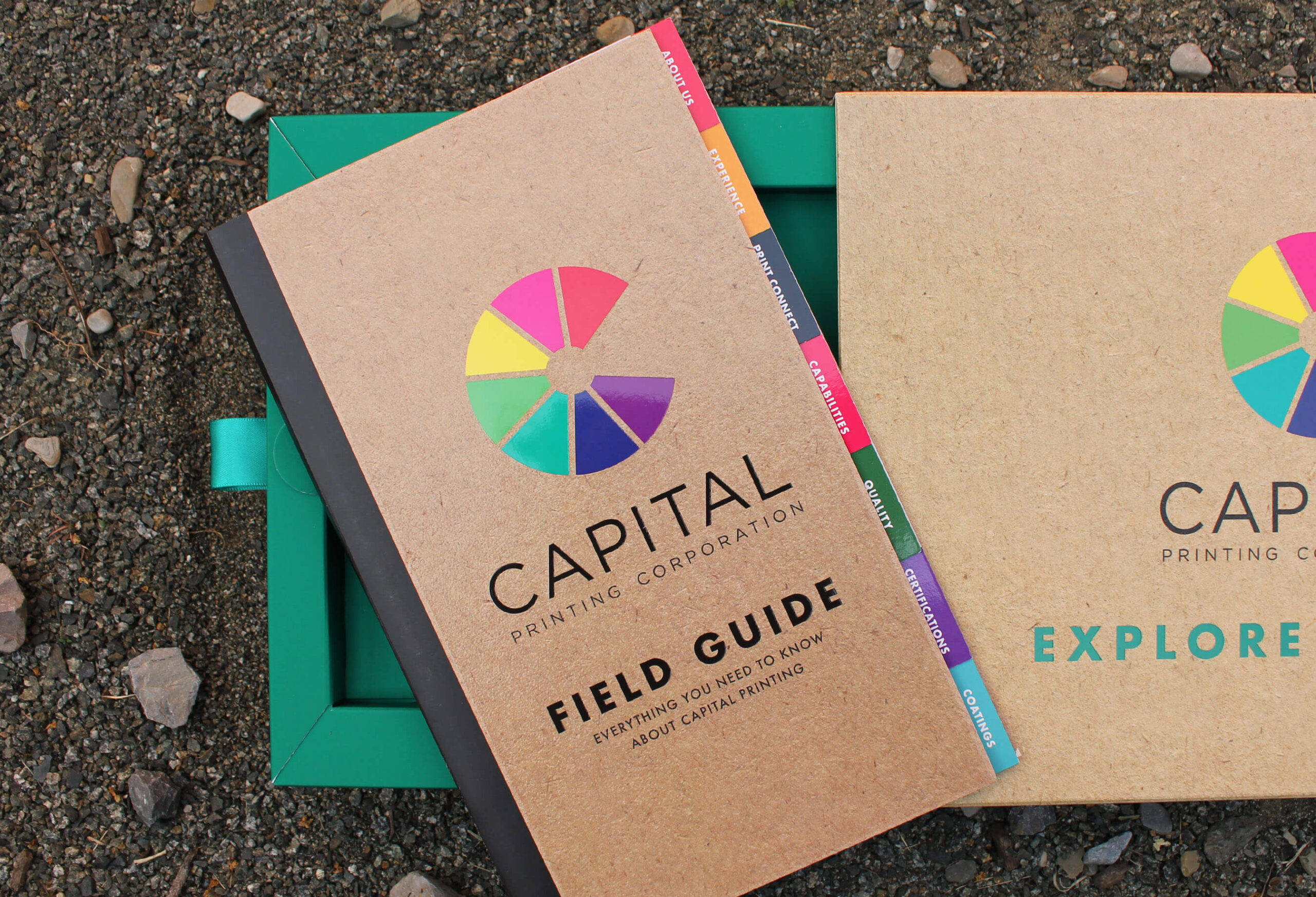
Bringing ideas to life: A collection of some of our favorite projects.
From logo design to responsive websites to custom API integrations, we’ve got you covered. Our team takes tremendous pride in our ability to transform concepts into captivating realities. We blend our passion for innovation with technical expertise to bring your ideas to life.
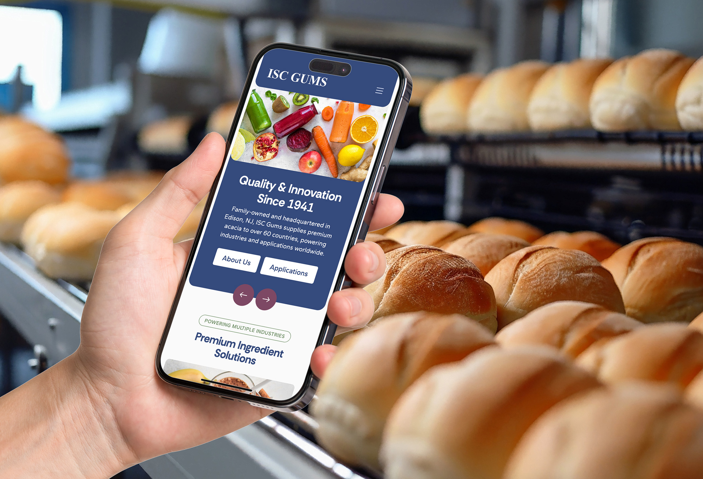
Supplying trusted natural ingredients to global industries
ISC Gums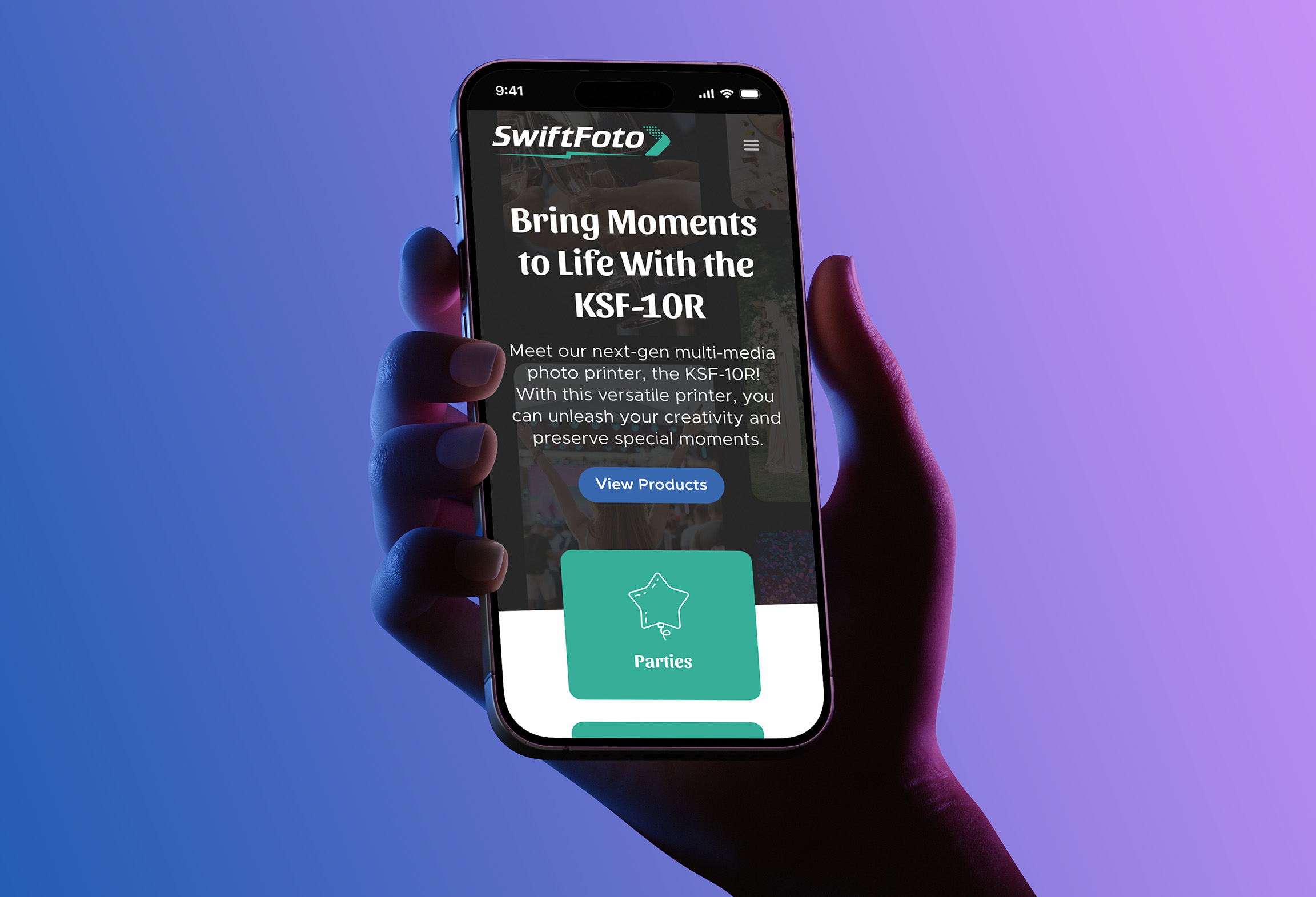
Preserving the magic of special events
SwiftFoto by Kanematsu USA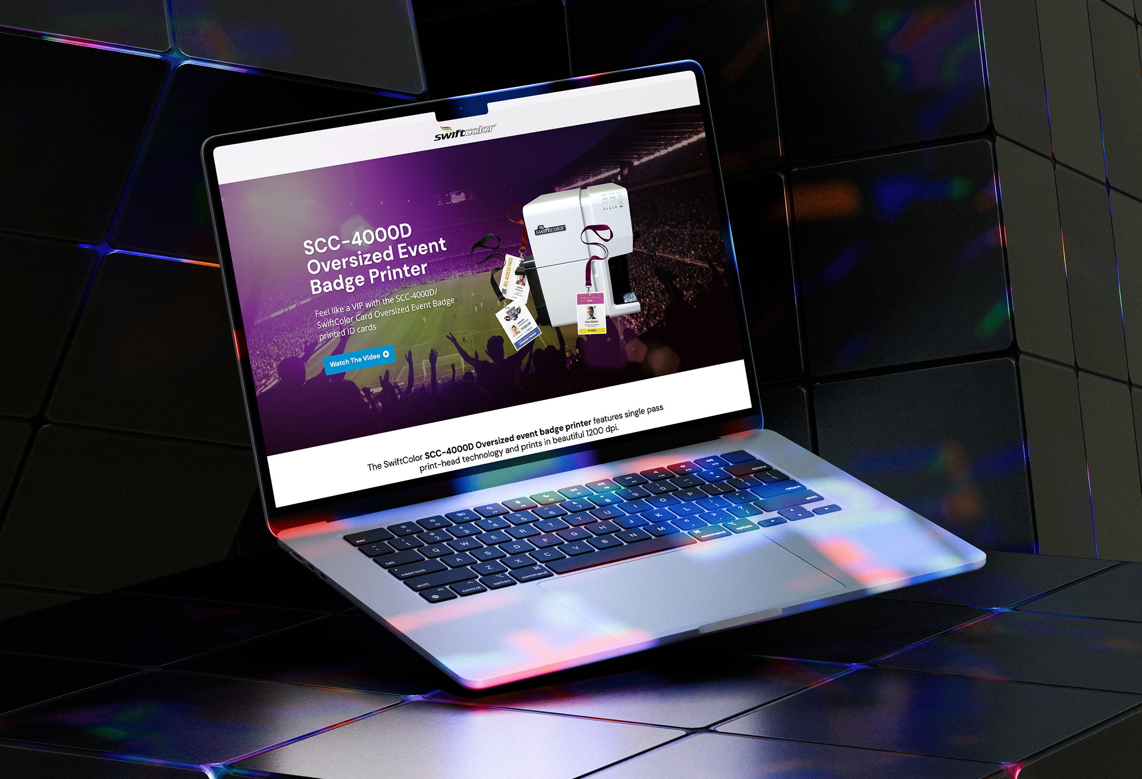
Executing streamlined events with high quality badge printing
SwiftColor by Kanematsu USA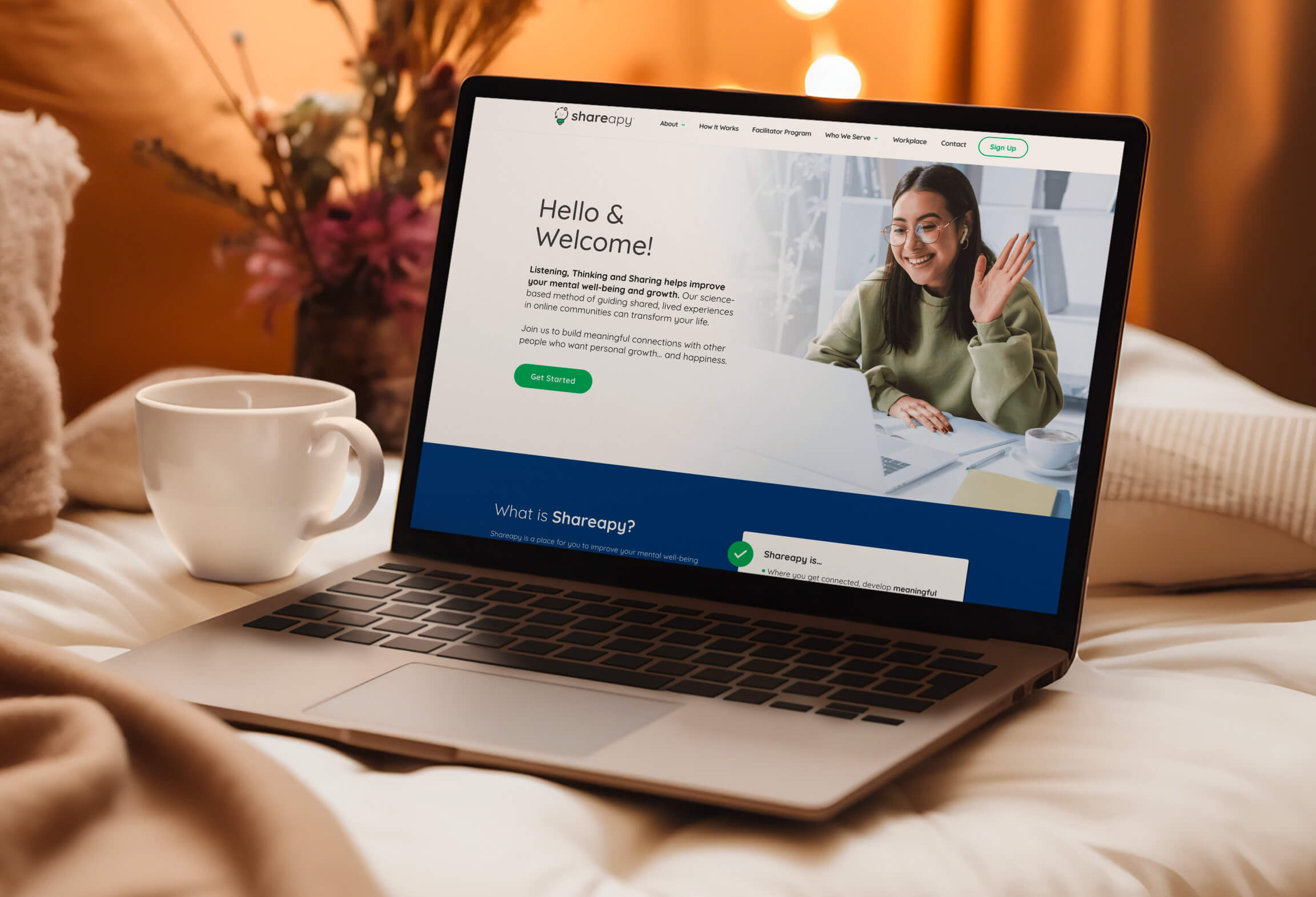
Establishing meaningful connections to improve personal development
Shareapy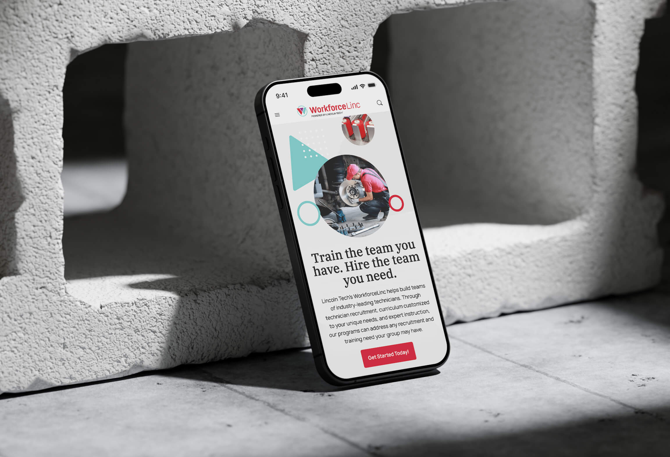
Building teams of industry-leading technicians
WorkforceLinc by Lincoln Tech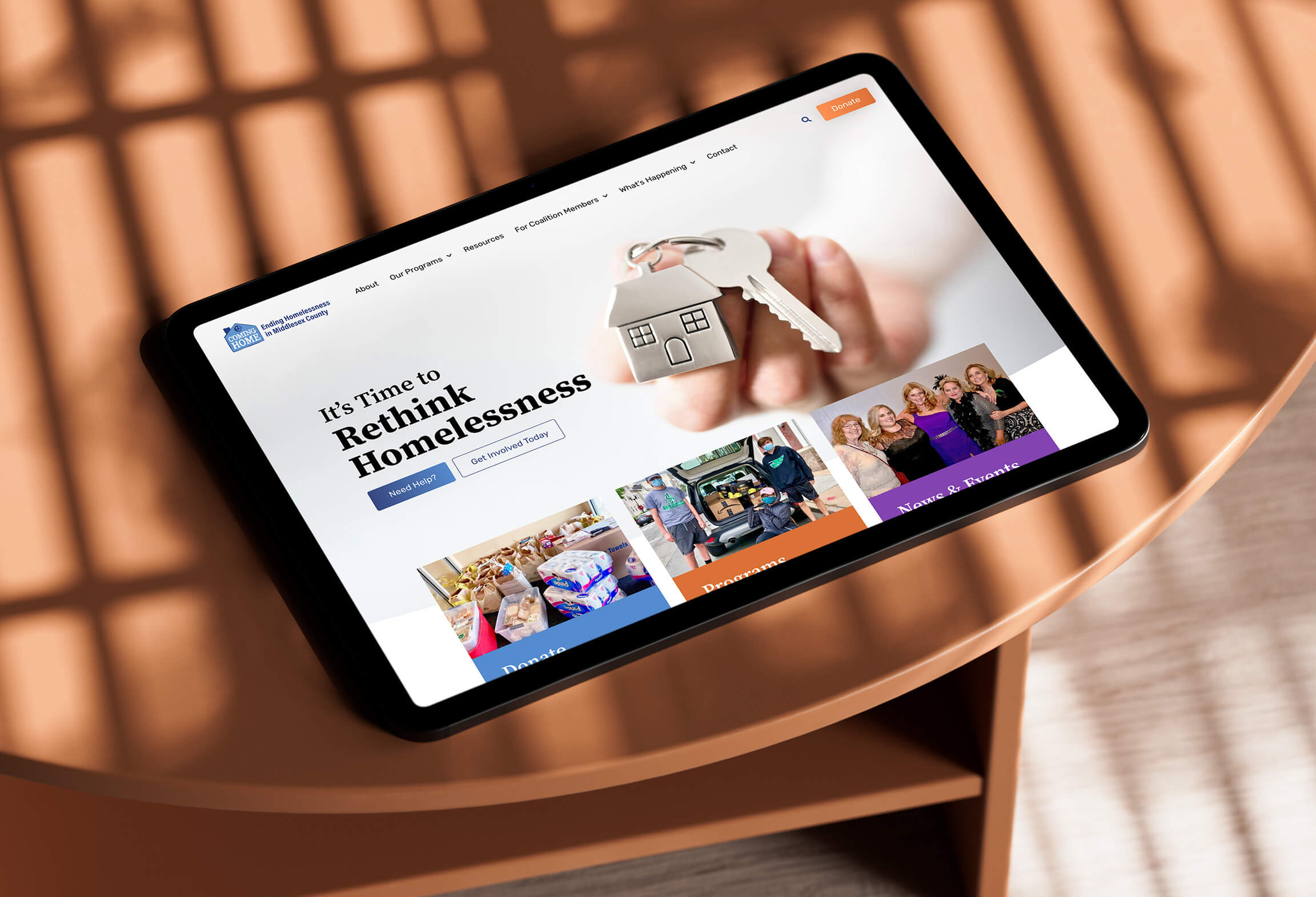
Working to prevent and end homelessness in Middlesex County
Coming Home of Middlesex County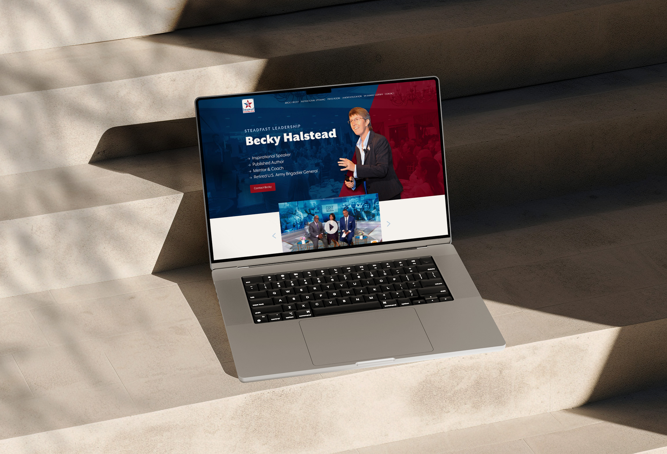
Leading teams with character and purpose
Steadfast Leadership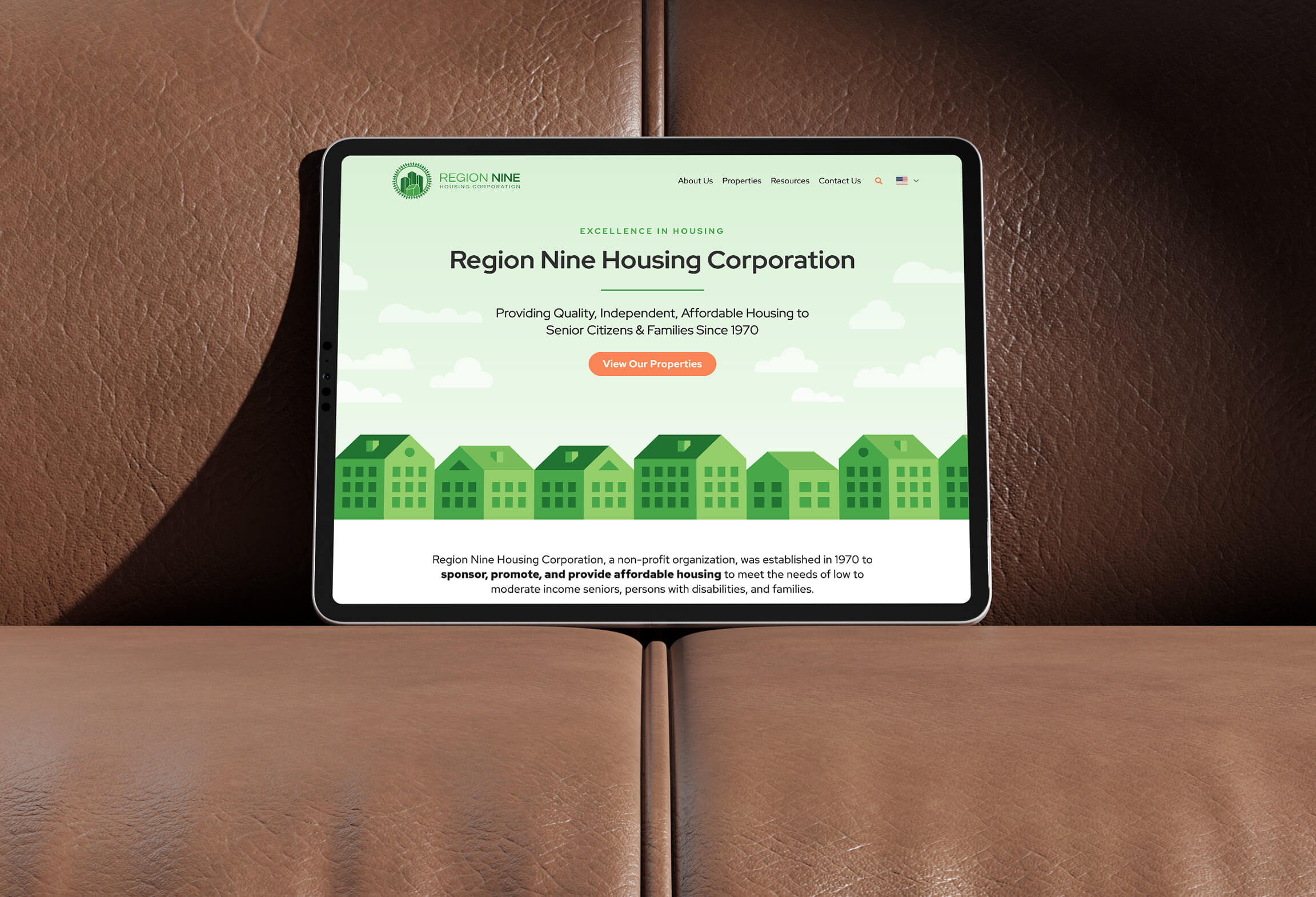
Providing quality affordable housing to families and seniors
Region Nine Housing Corporation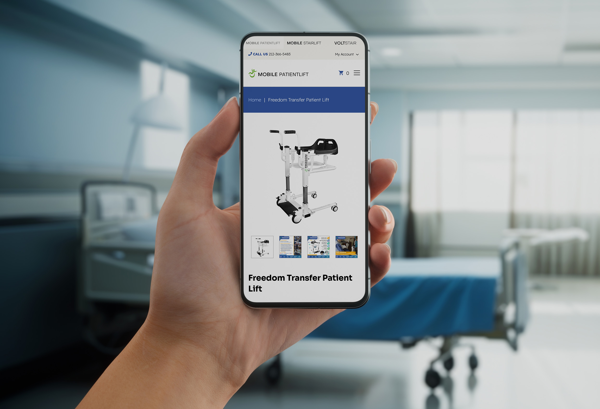
Empowering patients with limited mobility
Mobile PatientLift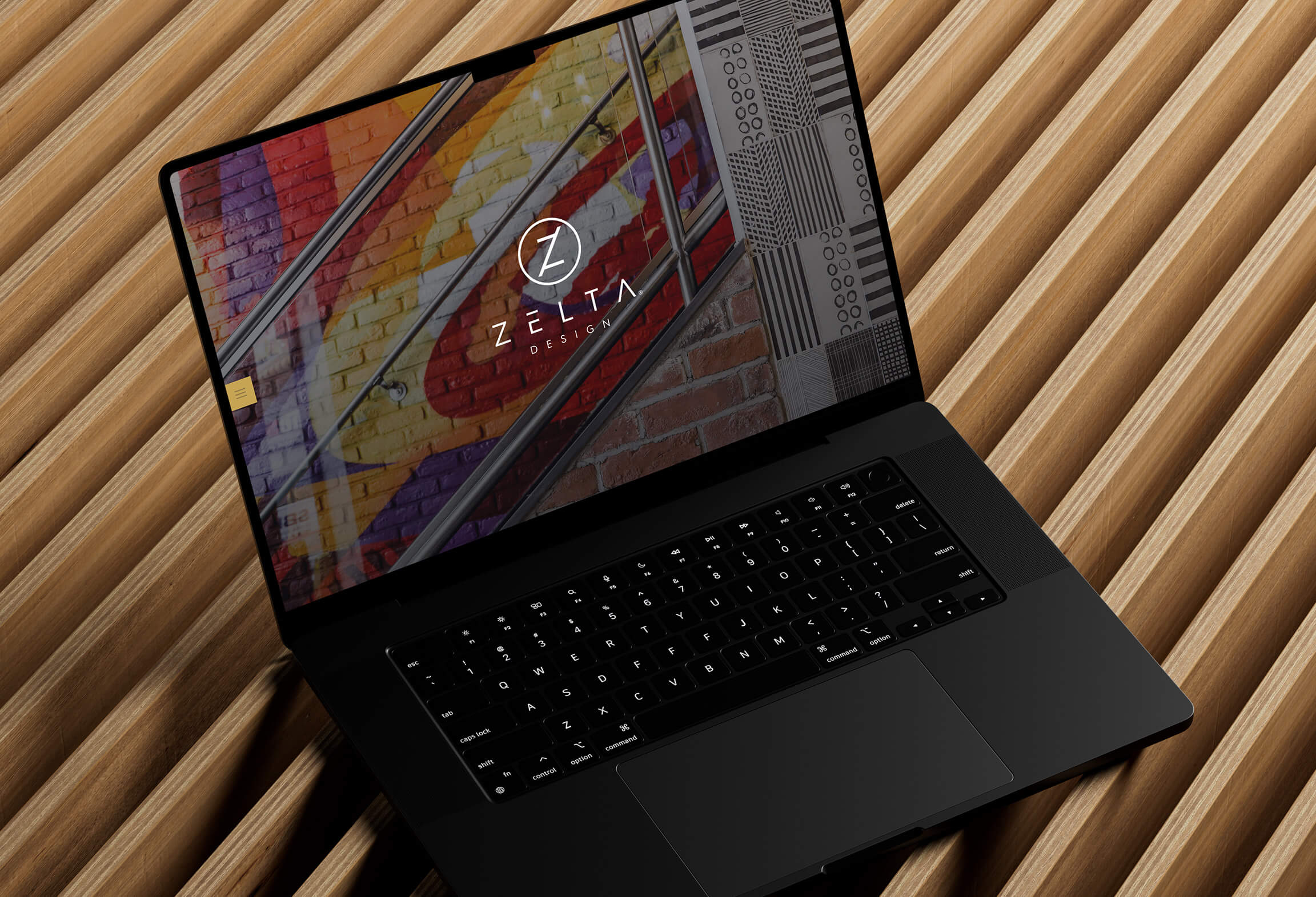
Crafting unforgettable spaces for big names
Zelta Design